Mito Workshop generates its own power.
The name is a mitochondrion, the part of a cell that makes usable energy without importing any. Everything here runs on local inference, on machines in one house.
Category
Not a company and not a product. A working bench that publishes what happens on it.
Premise
Everything runs on local inference on hardware in one house. No external API calls, no token bills, no accounts, no subscriptions, no roadmap, and no support.
Proof
The site shows what is currently running on the machines, and shows the failures alongside the successes.
Audience
People who build things themselves and can tell the difference between a working tool and a landing page.
Voice
Measured, specific, and unhurried. States facts and does not sell. Numbers where numbers are available.
Register
Woodworking and drafting: gauge lines, mitres, stock, and kerf. Never the visual language of software.
| Cap height / stem | 100 / 22 units |
| Mark ratio | 170 : 142, fixed |
| Band | ½ stem · 11 units |
| Tick | 20⁄22 stem · 20 units |
| Gap | 10⁄22 stem · 10 units |
| Letter height | 72 units, redrawn not squashed |
| Diagonal weight | 19.54 perp, matches the M |
| Seam | vertical center, cutting both |
W is the M rotated 180 degrees, so the monogram is one letterform and its own rotation: turn the mark upside down and it is unchanged. Band, tick, and gap are fixed against the stem and never rescale independently of it.
One stem of clear space on every side, measured from the tick (22% of cap height at any size). Nothing crosses the boundary.
Above 151px wide, use the drawn lockup (MITO's cap lands at 32px, where the cut band stays open). Below it, reduce to the mark. The mark holds to 16px and no smaller; under 24px it uses the optical build with a thicker band and ticks, which is what the favicon ships.
 16 optical
Ink · #15161A
Wordmark, body copy, and dark grounds
16.57:1 on paper
Paper · #F6F5F1
Page ground, reversed marks
16.57:1 on ink
Layout Blue · light · #2E71B9
Descriptor, ticks, and links on paper
4.61:1 on paper
Layout Blue · dark · #5297DE
Same roles on ink
5.89:1 on ink
Graphite · light · #5A5C63
Secondary text on paper
6.12:1 on paper
Graphite · dark · #9EA0A8
Secondary text on ink
6.93:1 on ink
Fault · #C83E26
Status indicators only, never a brand color
4.61:1 on paper
Rule · #DBD8D1
Hairlines only, never text
decorative
This property runs the dark ground as its primary, so Layout Blue ships at its dark value (#5297DE) and Ink and Paper trade places. The ground itself is an off-black blue ink, so the workshop does not read like its neighbours.
Shorthand greys are convenient to audit by eye, but they are not interchangeable. #999 fails on paper, and #666 on #333 is 2.20:1, so the ramp cannot stack on itself.
| Value | On paper | On ink | May carry |
|---|---|---|---|
| #333333 | 11.58:1 | 1.43:1 | Body text on paper. Never a dark ground; it caps the accent at 3.39:1. |
| #666666 | 5.26:1 | 3.15:1 | Secondary text on paper. Clears AA, misses AAA. Illegal on any dark ground. |
| #999999 | 2.61:1 | 6.35:1 | Dark grounds only. Fails on paper; cannot carry text or a UI boundary there. |
| #5A5C63 | 6.12:1 | 2.71:1 | Secondary text on paper. The system's value; outperforms #666. |
| #9EA0A8 | 2.39:1 | 6.93:1 | Secondary text on ink. The system's value; outperforms #999. |
| #DBD8D1 | 1.30:1 | 12.70:1 | Hairlines only. Decorative dividers are exempt. |
The 2017 Revised 508 Standards incorporate WCAG 2.0 A and AA by reference, so the governing criterion is SC 1.4.3: 4.5:1 for normal text, 3:1 for large. Ink on paper measures 16.57:1, which clears AA by 3.7 times and clears AAA twice over.
The lockup is exempt regardless: SC 1.4.3 carries an explicit logotype exception, and the same exception appears in WCAG 2.1 SC 1.4.11 for non-text contrast. The marks pass anyway, but nothing here depends on that.
One item sits outside 508 and is decided on purpose: hairlines at 1.30:1 are fine as decorative dividers, but a rule that becomes the boundary of an interactive row becomes user-interface component identification under WCAG 2.1 SC 1.4.11 and needs 3:1. Layout Blue ships at two values because no single value clears 4.5:1 against both grounds (the ceiling is 4.06:1); if a graphic needs one value on both, #327AC7 holds 4.06:1 and 4.08:1, which passes the 3:1 non-text threshold but not text.
Display and body: Archivo
Archivo
Labels and machine-readout: IBM Plex Mono
IBM Plex Mono: 0123456789
The wordmark is drawn rather than set from a typeface, and it is outlined in every file, so nothing depends on a font being installed. Plex Mono carries the descriptor, all labels, and any machine-readout text.
- 01
Drawn, not set
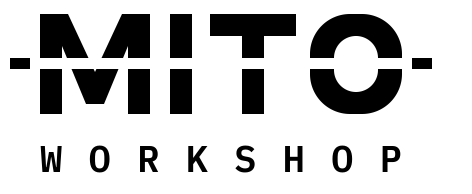
MITO is built from scratch on a 100-unit cap with a 22-unit stem. Nobody can reproduce it by buying a font licence, and no file depends on a typeface being installed. A workshop that makes its own power should not be renting its letterforms.
- 02
The cut is the concept
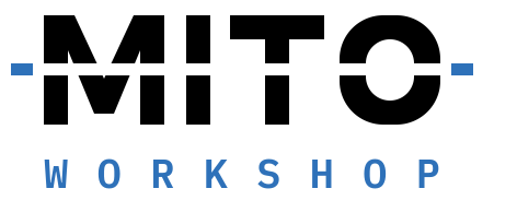
A single band scored through the wordmark at 44 to 55% of cap height, with reference ticks outside it so it reads as measurement rather than damage. It is a marking-gauge line across stock about to be worked. The site shows failures next to successes, and the wordmark shows the same thing.
- 03
The O carries the biology
A squared outer wall with a capsule counter, so the mitochondrion lives in negative space instead of being illustrated. It is the reduction and the favicon, and it means the identity never has to resort to a monogram or a picture of a cell.
- 04
One hue, two values
No single color clears 4.5:1 against both grounds, and the ceiling for this neutral pair is 4.06:1. Rather than pretend otherwise, the accent ships as one hue at two values, light and dark. The constraint produced the rule.
- 05
A register, not a look
Workshop tools and drafting sheets, not software products. Nothing here trades on gloss, gradient, or the visual language of AI. That is what makes it legible as a person’s bench rather than a company.
- 06
Built to sit still
There is no illustration to redraw, no mascot to age, and no trend to fall out of. Scored type and gauge marks have been in the drafting vocabulary for a century. The maintenance burden is one size rule.
- Do not re-set MITO in a system font. It is drawn, and there is no typeface that matches it.
- Do not move the cut band, change its height, or extend it into WORKSHOP.
- Do not put Ink on Layout Blue as text. That pairing is 3.60:1, which is non-text only.
- Do not two-color the wordmark itself. The accent belongs to the ticks and the descriptor.
- Do not add stroke, shadow, gradient, or rotation. The mark is flat and level or it is not the mark.
- Do not shrink the lockup past its threshold instead of reducing to the mark.
- Do not set WORKSHOP beside the wordmark. It is tracked to MITO’s width and only works beneath it.
- Do not reproportion the dash. Band, tick, and gap are fixed against the stem.
- Do not squash the mark to fit a square. Its ratio is fixed at 170:142; pad the frame instead.
Business card, 85 × 55mm, uncoated. The face carries the mark and nothing else; the reverse carries the address and the single claim the workshop actually makes. No personal details, by design.
Local inference, in a house
No accounts. 0 calls out.
What the workshop ships: three physical objects, all going out in the same kraft mailer. PRD booklets given away (89 × 140mm, 24 pp, free, no licence), sticker sheets, and anodised asset tags for the machines themselves. Single-color print, one accent pass. No invoice enclosed.
24 pp · free
- Node
- ORGANELLE / 04
- Role
- INFERENCE · GPU
- Egress
- NONE
- Commissioned
- 2026-03
The home page is a status board. It shows what is running, what shipped, what failed, and what was abandoned, with the failures given the same row treatment as everything else.
Nine machines. Nothing leaves the house.
A status board, not a pitch: what is running, what shipped, what failed, and what was abandoned, every row treated the same.
On a billboard the mark does the work alone: one line of mono, set in the accent, at a fraction of the wordmark's weight. Nothing else earns the space. 48-sheet, reversed, two color.
Nothing leaves the house.
Every mark ships as SVG (currentColor, except the favicon, which sets its own theme-aware fill). No masks, no embedded fonts, and all type outlined.

The most durable thing here is that it was drawn on purpose.
Every mark is live SVG, not an image. Type is outlined, so nothing depends on a font being installed. Contrast figures are computed WCAG 2 ratios, and the accent ships as one hue at two values because a single value cannot clear 4.5:1 against both grounds, a limit worth stating plainly on a site that runs its own accessibility checker against itself.